After some really helpful feedback i have changed various pages in my portfolio. I have also realised that I have missed a few pages that need to go in.
Here is my colour page. I have changed the exposure of the colour pallet image. This is because when printing the image and blowing the image to A3 this section wasn't seen.
This is my front page. You couldn't see the detail in the butterflies when I printed and blown the image up to A3. I also changed the exposure on the birdcage.
These designs have been darkened and the background lightened. These look a lot better than what the last ones looked. You could see the corner marks and the background looked un even and a mess.
I done my designs again because my final ones needed to look more professional. To do this i used a fashion figure and drew on top of it. I feel this looks a lot better because I drew the figure out and in some section such as the elbows the figure looked rushed.
I forgot to add various pages such as:


Here are my technical drawings. I produced these suing illustrator. As you can see design development has been used.
My Illustration..
Here is one of my illustrations..
Here is where I got my inspiration from.
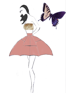
As you can see I have drawn my own version of the illustration. I then added my drawn skirt onto this and the bandeau top. Using illustrator I coloured the skirt in and added lace fabric to the bandeau. Getting my inspiration from a butterfly wing, I decided to add a butterfly.
My illustration..
Illustrations to help.
I seen the rose detail on this illustration and decided to re draw it for my rose skirt. I them used the skirt from the illustration because it mirrored the circle skirt i was making. I used the actual fabric I am using for this skirt, scanned it in and using photoshop attached the skirt to the illustration. I then added a rose to show my inspiration.
My Illustration..
I used this illustration to help me.
I sketched the dress section the added the legs, head and hair in. I scanned he image in on photoshop and changed the hair colour and the colour of the dress. I added butterflies because this is where my inspiration came from.
My Illustration..
This is the illustration I took sections from.
I sketched the dress and scanned it in. I failed to sketch the rest of the body so I looked for a illustration to help me. I came across this one and used the magnetic tool on photoshop to cut the arms, legs and head areas out. I did have to use the smudge tool to make the neck are fit my dress. I found this to be successful.
My Illustration..
The illustration I took certain sections from to help me.
I didn't really plan this one right. Looking at it now I feel the skirt section doesn't quite look right. I used the legs and head of the illustration because every time I tried to draw them myself it didn't look right.
My Illustration..
I wanted an innocent looking illustration for this dress. I also wanted a hairstyle that would reflect what i wanted on the catwalk, so I chose this illustration.
I added the butterfly to show where my inspiration came from. I feel it could have done with either some colour or more butterflies because there is to much white.


No comments:
Post a Comment